YouYoga
February 2022
I have designed a landing page for a newly-opened yoga studio basing on the user research I have conducted.
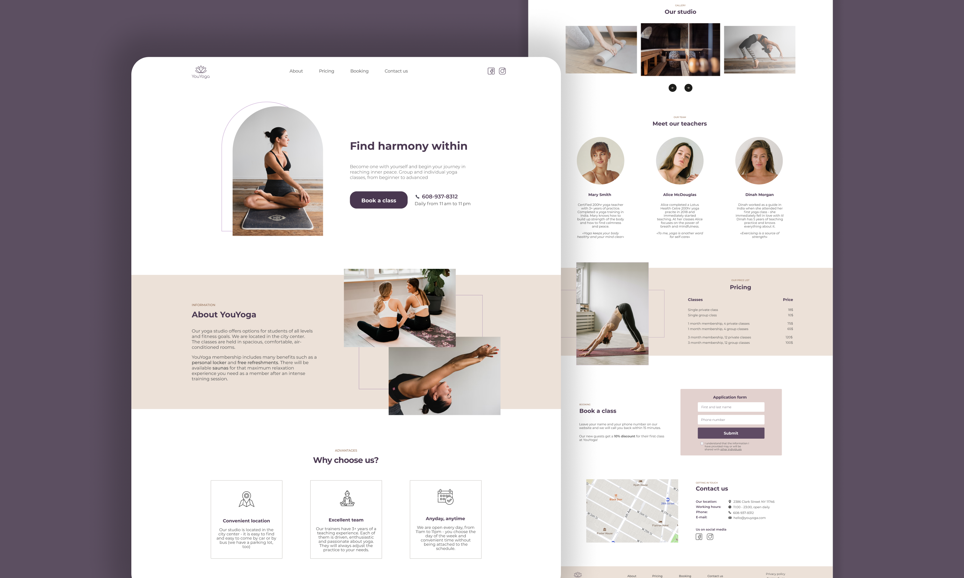
YouYoga is a new yoga studio situated in the city centre. As a recent startup, it needs a landing page with a clear-cut structure to attract new clients and show them which services it offers.
First, I conducted a little survey by asking my friends and acquaintances passionate about yoga and sports enthusiasts which information a yoga studio website page should contain to be of good use to them. The answers were mostly similar to one another. Basing on the answers I have made a list of the blocks the future landing page must include:
The primary target audience of the studio are fitness ethusiasts who tend to have busy schedules.
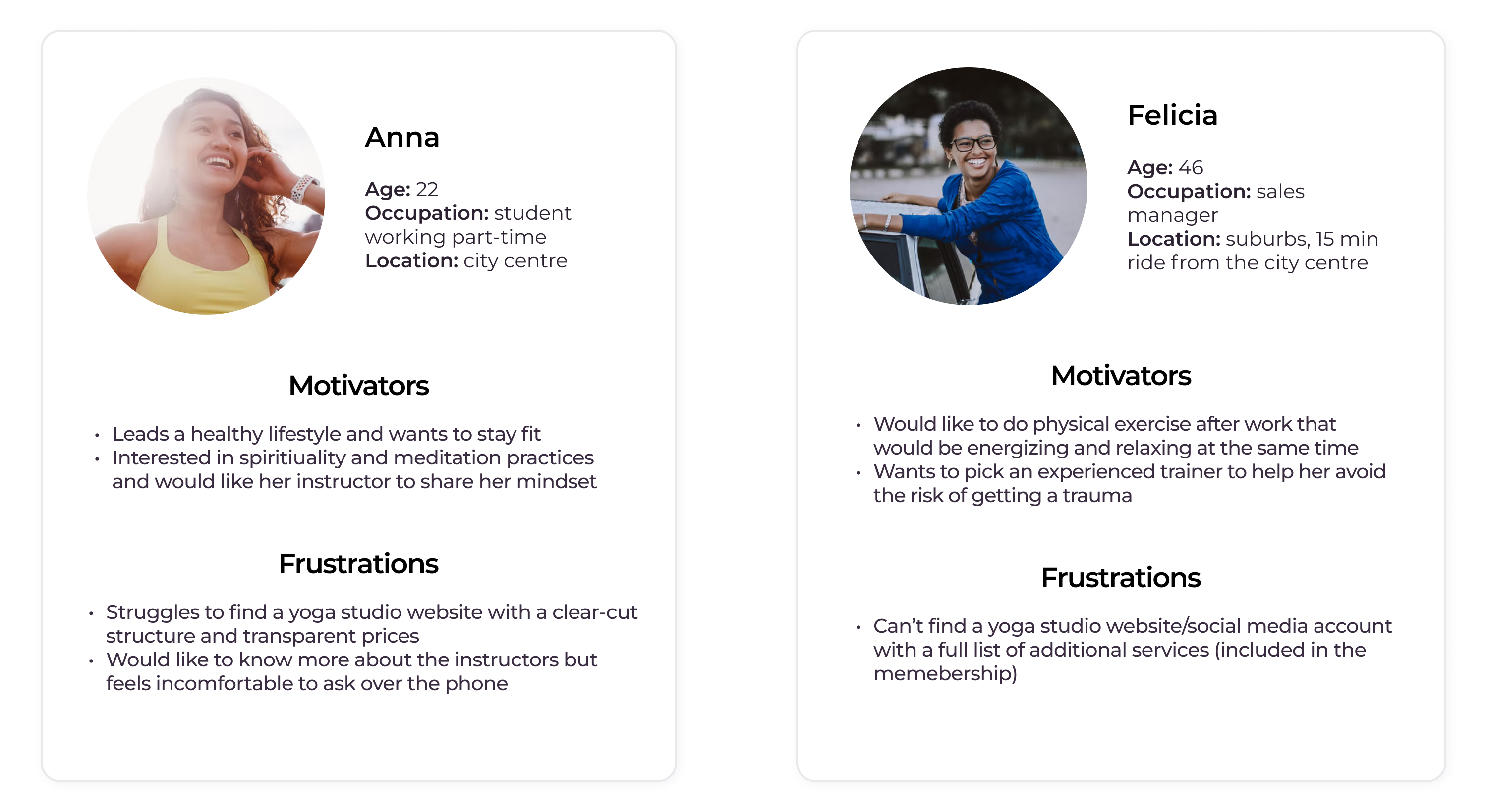
Creating user personas gave me a clear understanding of the user's needs. Now I was ready to make a low-fidelity prototype in Figma to generate the layout of the future landing page:
.png)
Colour choice makes a big difference when designing a product. I chose purple as the dominant colour - according to colour psychology, purple is associated with spirituality and serenity - things that yoga conjures.
.png)
I chose Montserrat as the only font family for my project - it is simple and easy to read.

I used a standard 12-column Bootstrap grid. The main purpose the landing page had was informing the future yoga studio clients about the studio’s services so the structure should be pretty clear-cut.
Finally, I created a set of components on Figma with appropriate variants that I reused throughout my design journey.
.png)
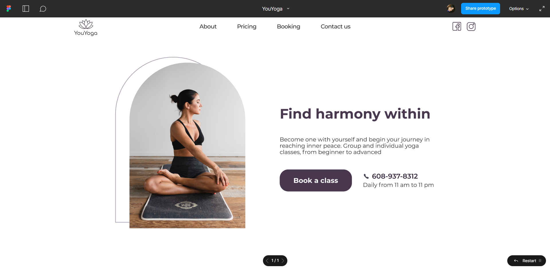
Click on the image to view the prototype.
The amount of time it takes to go through the landing page, find all the necessary information and make a decision.
This is my first UX project that I completed back in Feb 2022. I'm proud of it, yet now, a few months later, I can see quite a few faults with it. First of all, I realise now it would've been better if I made a Customer Journey Map at the stage of research to put myself in the shoes of a person who has just decided to find a good yoga studio and buy a membership there in order to gain more insights of the clients' needs. Even though YouYoga is a recently-opened studio, its landing page must contain positive client reviews to increase its credibility.
Another thing I would like to add to the landing page layout now is a blog. The blog might focus on familiarising the website visitors with yoga practices as well as update them on the news of YouYoga studio. I believe all I have just mentioned would significantly improve the experience of the yoga studio's potential clients and increase the studio's profit.

.svg)
.png)